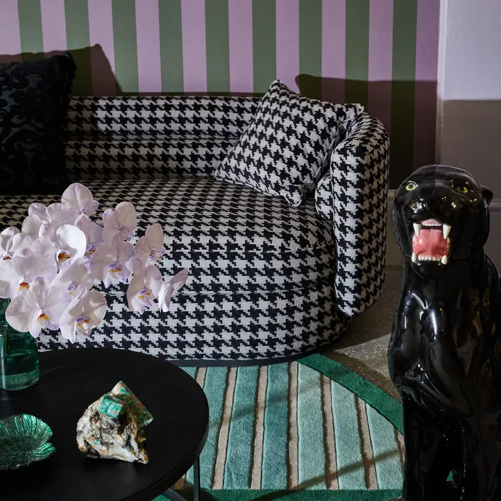
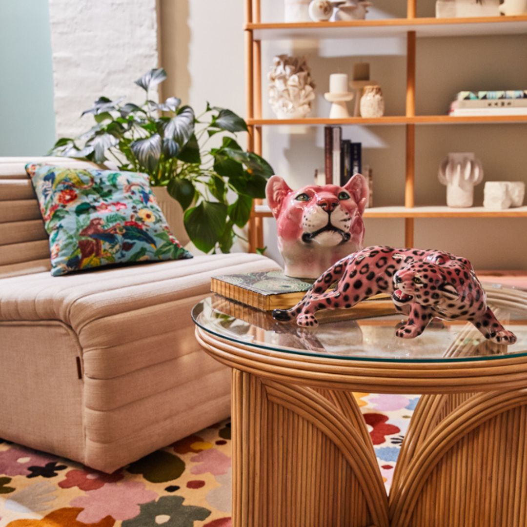
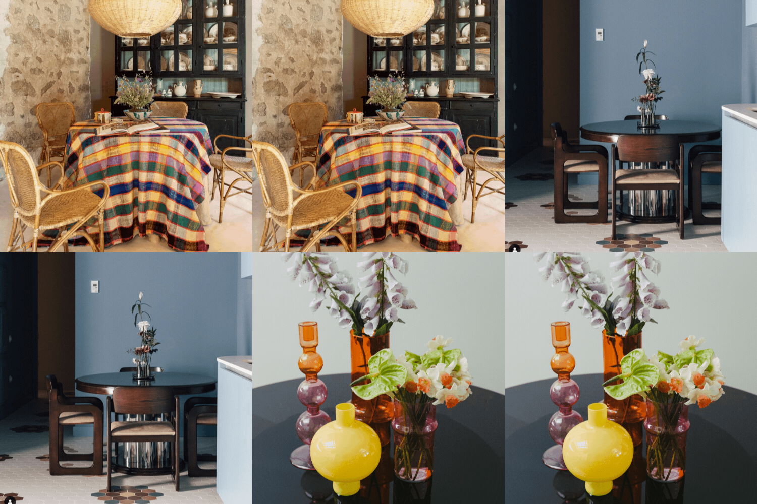
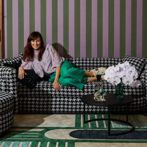
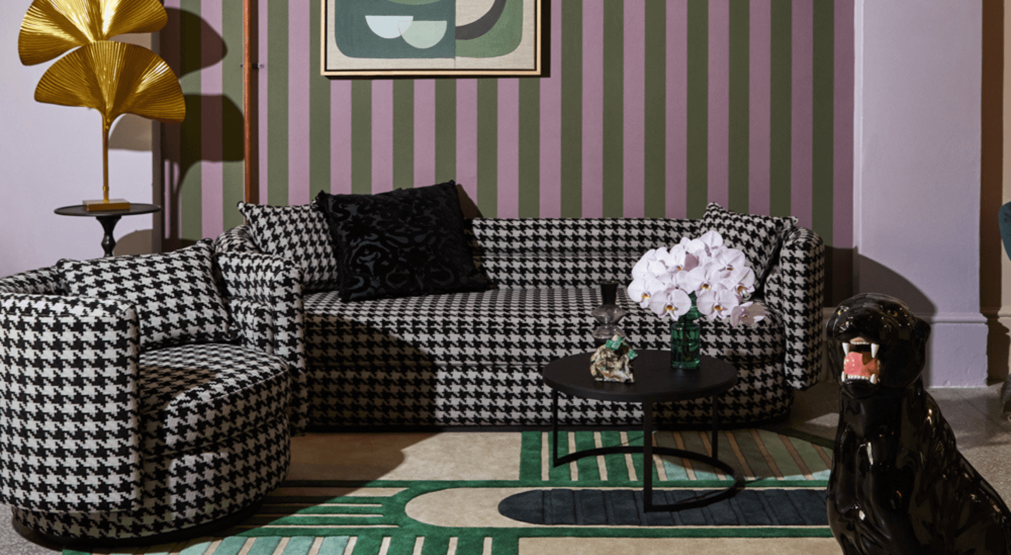
It all started with a vision from Katie Graham, founder and managing director of Love Tree; to refresh our long, high-ceilinged showroom into an ombre of striking colours.
When it came to choosing the right hues and paint for this project, we turned to our friends at Dulux - Australia’s most iconic paint brand.
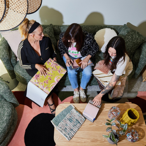
Our project collaboration started with a visit from Dulux colour expert, Andrea Lucena-Orr. We discussed the latest Dulux Colour Forecast and what tones would work best in our space. Our biggest requirement was to choose colours that would compliment our different ranges of furniture and homewares. Another important consideration was the durability and longevity, so Dulux Wash&Wear was a no-brainer.
Once we finalised the colour selections, it was on to measuring the amount of paint we’d need using Dulux’s handy calculator and organising a skilled painter to complete the job.
After a big 2 days of paintings (and a lot of furniture moving), the store was transformed. The array of hues breathed new life into the space, creating the feeling of micro-spaces within the store.
Our Love Tree Interiors, Chapel Street Store Refresh with Dulux Australia from Love Tree Interiors on Vimeo.
With such a wow-worthy new look, it was rude not to snap some stills. We called in talented photographer, Armelle Habib to do the store justice. Now let's take a look at this kaleidoscope of colours…

Dulux Nephrite
Described as a beautiful eucalyptus green, we knew that Nephrite was the perfect colour due to our love for our Australian culture and nature. It works so well with warm, contrasting colours like the Shiela Sofa in Terracotta.

Dulux Diorite
A fresher and cooler green, Diorote flowed seamlessly from Nephrite. Being a cooler paint colour, the bright indigo blue of the Cube couch just pops.

Dulux Green Alabaster Half
We needed something that reflected the light from the sky light in the middle of the store. A beautiful soft paint colour with a subtle green and slightly grey undertones - we knew Green Alabaster Half was the one. It works so well with our rattan and timber textures.

Dulux Mornington
We didn't want a pretty pink, we wanted a chic pink. More on the dusty side, Mornington was just what we were after. Paired with the Stevie sofa, it speaks sophistication.

Dulux Perplexed
We’ve been long time lovers of the classic vintage colour lilac, so Perplexed seemed like just the right fit for our wall rainbow. It’s created a sense of elegance in our showroom space.

Dulux Cinnamon Sand & Domino
Working with existing paneling and Gucci wallpaper in our upstairs Styling Rooms we needed two hues that worked back with this. The popular charcoal, Domino, was perfect for the walls, and the warm brown-based orange Cinnamon Sand brought out the colours of the wallpaper.

